|
|
Post by SF Demons on Jul 17, 2013 16:18:12 GMT -5
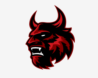
With the NLHS4 season approaching the Chicago Bootleggers have released their new logo. "This is an exciting time for the team," announced Chicago GM Reid Cathcart. "After our NY Mets style collapse at the end of last season we are looking to make amends. This logo represents a new era for the team, one that should bring plenty of fun and excitement to our fans." Cathcart said that there has been a production issue preventing the release of the new jerseys. "We have searched far and wide for a good template on which to base our design. If any of your readers know of any good templates out there we would love to hear from them." He also stated that any resemblance to the ECHL's Las Vegas Wranglers logo is purely coincidental. Attachments:
|
|
|
|
Post by International Hockey Club on Jul 17, 2013 16:23:53 GMT -5
For my jerseys, I mostly just recolor. The ones now are the Leafs' (barf) old thirds, recolored in blue and gold. As for me, I'm still gonna use the C with the hat on it for the Boots  It's more original than a coincidental resemblance lol |
|


 It's more original than a coincidental resemblance lol

